
Use Tableau to build an org chart from Excel
Business Problem
I wanted to create a flexible solution to create an org chart without having to put the data in our HRIS database. This could be handy in a reorganization or acquisition when our HR team wanted to sketch out multiple scenarios in early planning. I wanted to use Excel to hold the data, and I wanted the spreadsheet format to be easy for anyone to understand and update.
Solution Design
Because we didn’t know in advance the number of employees to be included in the org chart, I decided to the org chart as a series of subsets showing each employee, their manager, and their direct reports. This makes a crows-foot pattern, with the selected employee in the center. Users click on one of the “toes” to navigate up or down in the hierarchy. The result is on visible on Tableau Public. You can also download the source spreadsheet and Tableau workbook from my GitHub repository.
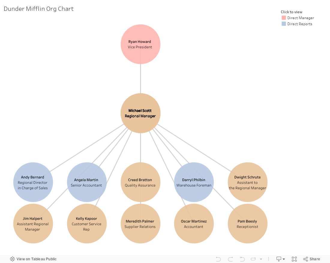
Tableau Data Source
For the proof of concept, I used a very simple spreadsheet with three columns: Employee, Manager, and Job Title. This made it easy for someone else to update the data for the org chart. You could add other descriptive columns.

To draw a line on a map, Tableau requires a record for the starting point and the ending point. The records for the start and end must both have the same label so that Tableau knows they go together. For example to draw a line from Ryan Howard to Michael Scott, I need two Ryan Howard-Michael Scott records: one with Ryan’s coordinates and one with Michael’s coordinates. Because I am displaying the links from employee to manager and from employee to direct reports, I need four copies of the spreadsheet in Tableau.
Create a new Tableau workbook and connect to your Excel spreadsheet. Remove the sheet that opens by default in the data source window. Drag “New Union” under the sheets pane on the data source window. Put four copies of your Excel sheet into the union window.

After you click OK, double click on the name “Union” and change it to “Connections”.
Now drag another copy of your sheet onto the data window to join to the union data. Double click on the new sheet and change the name from “Sheet14” to “Managed By.” Click on the connection and change the join type to left. The field on the left should be “Manager” and the field on the right should be “Employee”. This will allow you to relate each employee to his or her manager.

Drag another copy of the sheet onto the data window. Double click on the new sheet name and change the name to “Indirect Manager.” Click the connection and change the join type to left. The field on the left should be “Manager” in “Managed By” (the copy of the sheet you added in the previous step, not the union). The field on the right should be “Employee” in “Indirect Manager” (your latest copy of the sheet). This will tell you if there are more managers above the employee’s direct manager.

Drag another cop of the sheet onto the data window. Change the sheet name to “Manages.” Change the join type to Left. Make the field on the left “Employee” from the union data and the field on the right “Manager” in the latest copy of your sheet. This will allow you to relate each employee to their direct reports.

Drag one last copy of the sheet onto the data window. Change the sheet name to “Indirect Reports.” Change the join type to left. The field on the left should be “Employee” in “Manages” (the copy of the sheet you added in the previous step, not the union). The field on the right should be “Manager” in “Indirect Reports” (your latest copy of the sheet). This will tell you if there are more reports below the employee’s direct reports.

Calculated Fields
Now we can go to the first Tableau worksheet in your workbook. All of the fields in the joined worksheets have long names that were auto-generated by Tableau. Right click all these fields and rename them to include the name of the data source they are coming from. For example change “Job Title (Sheet14) #1” to “Job Title (Indirect Manager)”. This will make your calculations more understandable.

Create a calculated field called “Connection”. This is the link between the endpoints of the lines. Tableau has given each table in the union a unique Table Name automatically. Sheet1 represents the manager in the employee-to-manager line. Sheet11 represents the employee on the employee-to-manager line. Sheet12 represents the employee in the employee-to-report line. Sheet 13 represents the report in the employee-to-report line. So our connection formula looks like this.
if [Table Name] = 'Sheet1' or [Table Name] = 'Sheet11'
  then [Employee] + '-' + [Manager]
elseif [Table Name] = 'Sheet12' or [Table Name] = 'Sheet13'
  then [Employee (Manages)] + '-' + [Employee]
end
Create a calculated field called “Employee Label”. This will tell Tableau which employee name to display in each circle.
if [Table Name] = 'Sheet1' then [Manager]
elseif [Table Name] = 'Sheet11' then [Employee]
elseif [Table Name] = 'Sheet12' then [Employee]
elseif [Table Name] = 'Sheet13' then [Employee (Manages)]
end
Next we need a calculated field for the maximum employee label. This is used for the filter action we will be using later. Without the calculated field, when a user clicks on a line, the filter will be cleared and all the employee org charts will be superimposed on top of each other. Call the field “Max Employee Label” and use this formula.
max([Employee Label])
We can use a similar formula to “Employee Label” for each other piece of information we want to display on the org chart. Create a calculated field called “Job Title Label” with this formula.
if [Table Name] = 'Sheet1' then [Job Title (Managed By)]
elseif [Table Name] = 'Sheet11' then [Job Title]
elseif [Table Name] = 'Sheet12' then ''
else [Job Title (Manages)] end
We need to know how many direct reports there are below the employee to calculate the layout. Create a calculated field called “Manages Label” with this formula.
if [Table Name] = 'Sheet13' then [Employee (Manages)] end
When we lay out the direct reports below the manager, we might need to split them up into multiple rows. Create a new integer parameter called “Nodes in a Row” that we can adjust to control the layout.

To calculate the X and Y position, we need to number the direct reports, starting with 0. Create a field called “Manages Rank” with this formula.
running_count([Max Employe Label]) -1
Now we can use this parameter to calculate the X and Y coordinates for each node in the org chart. The Y value for the manager will always be 0 and the employee will always be 1. The Y value for the direct reports depends on whether or not we have to split the reports into multiple rows. Create a calculated field called Y with this formula.
if max([Table Name]) = 'Sheet1'
    then 0
elseif max([Table Name]) = 'Sheet11' or max([Table Name]) = 'Sheet12'
    then 1
elseif max([Table Name]) = 'Sheet13'
    then
        if ([Manages Rank])/[Nodes in Row] = int(([Manages Rank])/[Nodes in Row])
            then ([Manages Rank])/[Nodes in Row]*0.6+2
            else int(([Manages Rank])/[Nodes in Row])*0.6+2
        end
end
On the X axis, the direct reports will be positioned along their rows according to the “Manages Rank” field. The manager and employee should be centered above the direct reports.
if max([Table Name]) = "sheet1" or max([Table Name]) = "sheet11" or max([Table Name]) = "sheet12"
    then
        if  (max({fixed [Employee]: countd([Manages Label])})-1) >= [Nodes in Row]
            then ([Nodes in Row]-1)/2
            else (max({fixed [Employee]: countd([Manages Label])})-1)/2
        END
    ELSE
        ([Manages Rank]) % [Nodes in Row]
End
We want to color our nodes to indicate whether or not there are more employees above or below the employees currently displayed on the chart. Create a calculated field called “Click to view” with this formula.
if [Table Name] = 'Sheet1' and not isnull([Employee (Indirect Manager)]) then 'Direct Manager'
elseif [Table Name] = 'Sheet13' and not isnull([Employee (Indirect Reports)]) then 'Direct Reports'
end
My job titles are a little long to fit on one line, so I’m going to split it into two lines at the first space after the eleventh character. Create a field called “Job title 1” with this formula.
if find([Job Title Label], ' ', 11) > 0
    then mid([Job Title Label], 0, find([Job Title Label], ' ', 11))
    else [Job Title Label]
end
Create another field called “Job title 2” to hold the rest of the job title.
if find([Job Title Label], ' ', 11) > 0
    then mid([Job Title Label], find([Job Title Label], ' ', 11)+1)
end
Layout Visualization
Now we’re ready to layout the visualization. We will do a dual axis chart with the lines on the main axis and the circles for the nodes on the secondary axis.
Put X on the columns and Y on the rows. On the marks card, change the marks from automatic to line. Put Employee Label on the filter card and exclude null values. Put Employee from the Connections data source on the filter as well and select one employee to be the center of your org chart. Put the Connection calculated field on the detail card. Put the Table Name field from the Connections data set there too. Your visualization will look something like this, which doesn’t look like you might have imagined, but don’t panic!

You can see the triangles next to X and Y indicating that they are table calculations. Click on the drop down next to X choose edit table calculation. Choose Compute Using “Specific Dimensions” and check the box next to “Connection.”
Edit the table calculation for Y and set it the same way as X.
Right click the Y axis to edit it. Select the Reversed check box under scale. Now we’re looking much closer to the finished product.

Next we want to create circles to represent the employees at the end of each of the lines. Drag the Y calculated field to the right side of the chart so that it creates a dual axis chart. This will break the table calculation for your line chart, but we’ll fix it later. Right click the Y axis on the right side of the chart and tell it to synchronize the axis. Change the mark type on the second Y axis to circles, and adjust the size on the size to make the circles bigger. Put “Click to view” on the color card. Right click on the “Click to view” in the color. Put “Employee Label,” “Job Title 1,” and “Job Title 2” on the label card. Click on the label card and format the label. Set the alignment to middle center and adjust the text to the way you like it. I put the Employee Label in bold cut down the font size for Job Title 1 and Job Title 2. Check the box for “Allow marks to overlap.”
Put Connections and “Table Name” in the detail card. We’ll use those for the table calculation.
Put “Max Employee Label” on the detail card. This is for the filter action.
Here’s what my final marks card looks like for the secondary axis.

Now we need to edit the level of detail connections for the X on the columns and Y on the secondary rows axis. Edit the table calculation for Y and choose “Specific Dimensions.” Check the box next to all dimensions except for “Table Name.” If you add more dimensions to the marks card, you will need to come back here and check their boxes in the Y table calculation.

Edit the table calculation on X. Select “Specific Dimensions” and check every dimension except for “Table Name” as you did on the secondary Y. Click the triangle next to “Automatic Sort” and change to custom sort. Sort on “Employee Label”, Maximum.

We’re almost done. Your viz should look like this.

Final Touches
Right click the Y axis on the left and unselect the check check mark for “Show Header.” The axis label and tick marks will disappear. Do the same thing for the Y axis on the right. Right click the X axis and choose “Edit axis.” Uncheck the box for “Include zero” and click OK. Right click the axis again and uncheck “Show Header.”
From the worksheet menu, choose “Actions.” Click “Add action” and choose a filter action. Under “Target Filters” choose “Selected Fields.” For the Data Source field choose “Max Employee Label,” and for the Target field choose Employee.

Now you should have a working viz. The rest is cosmetic tiding up.
- I created a dashboard and set the size to Letter Landscape (1100 X 850).
- I changed the font on the job titles to Arial Narrow to condense them a bit.
- I adjusted the colors.
- I simplified the tool tip
I didn’t like “Null” showing up in my “Click to view” color legend, so I duplicated my org- chart sheet and filtered out “Null” click to view. I added this as a tiny floating viz to the dashboard. Then I removed the color legend from sheet 1 and added the color legend from sheet 2.